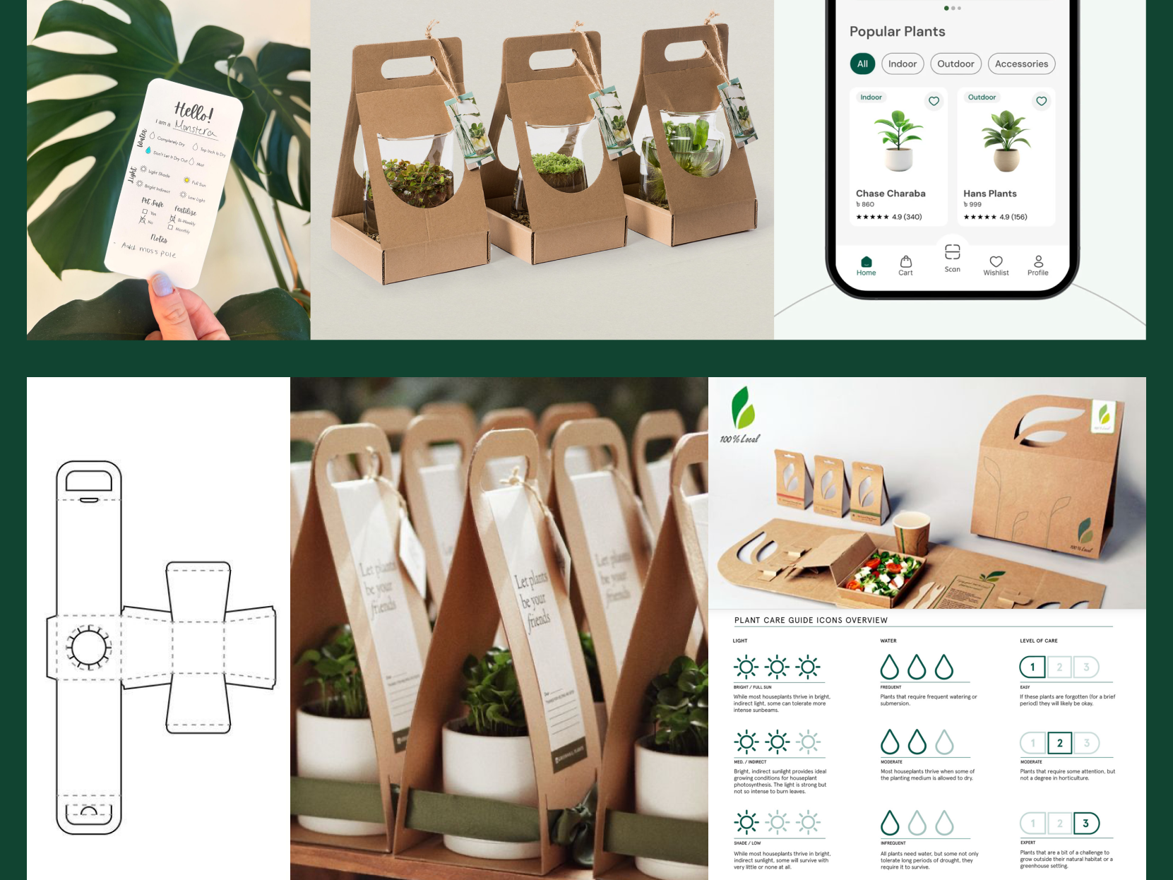
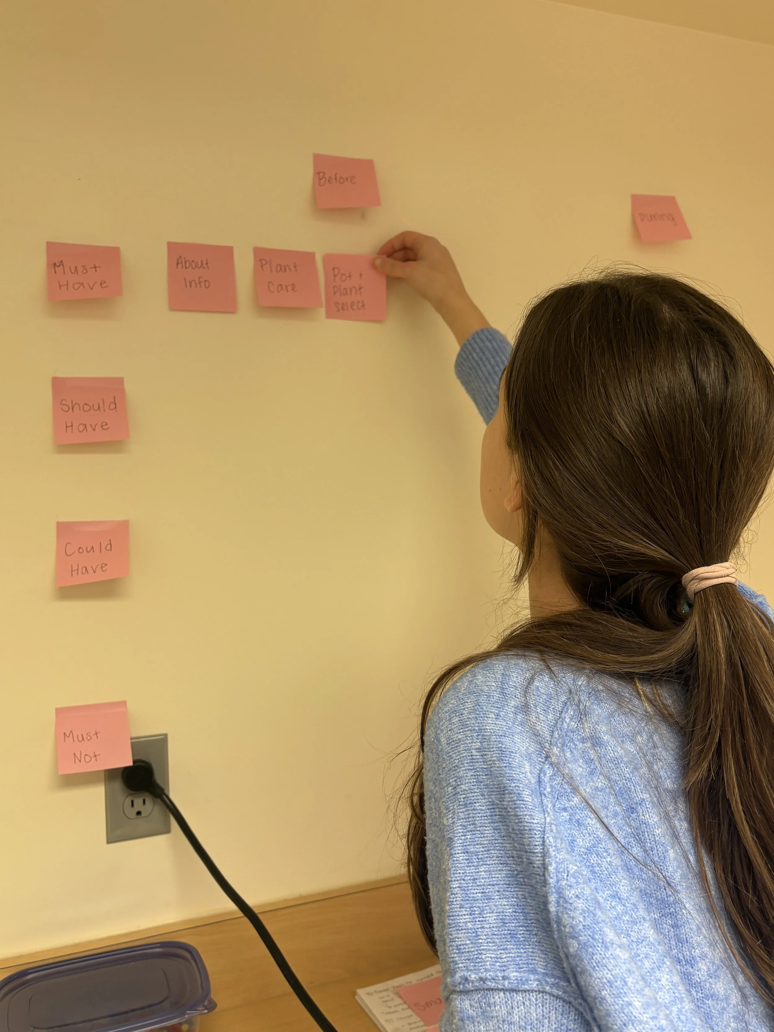
Project Overview
This was a rebranding project with the restriction that it needed to be a local business in the Grand Rapids area and that there had to be a strong reason for rebranding it.
The brand I chose to focus on was Unique Plant Boutique, a plant store that emphasizes service, community, and a diverse plant selection.
Why Rebrand?
This brand is due for a rebrand because inconsistencies in style choices make it feel disjointed, and its visual elements appear outdated.
The website also has opportunity to better represent the products and services offered, and the branding online is actually not cohesive with the in-store experience.
Additionally, the website contains broken links, creates a false sense of what is offered, and includes blank pages.
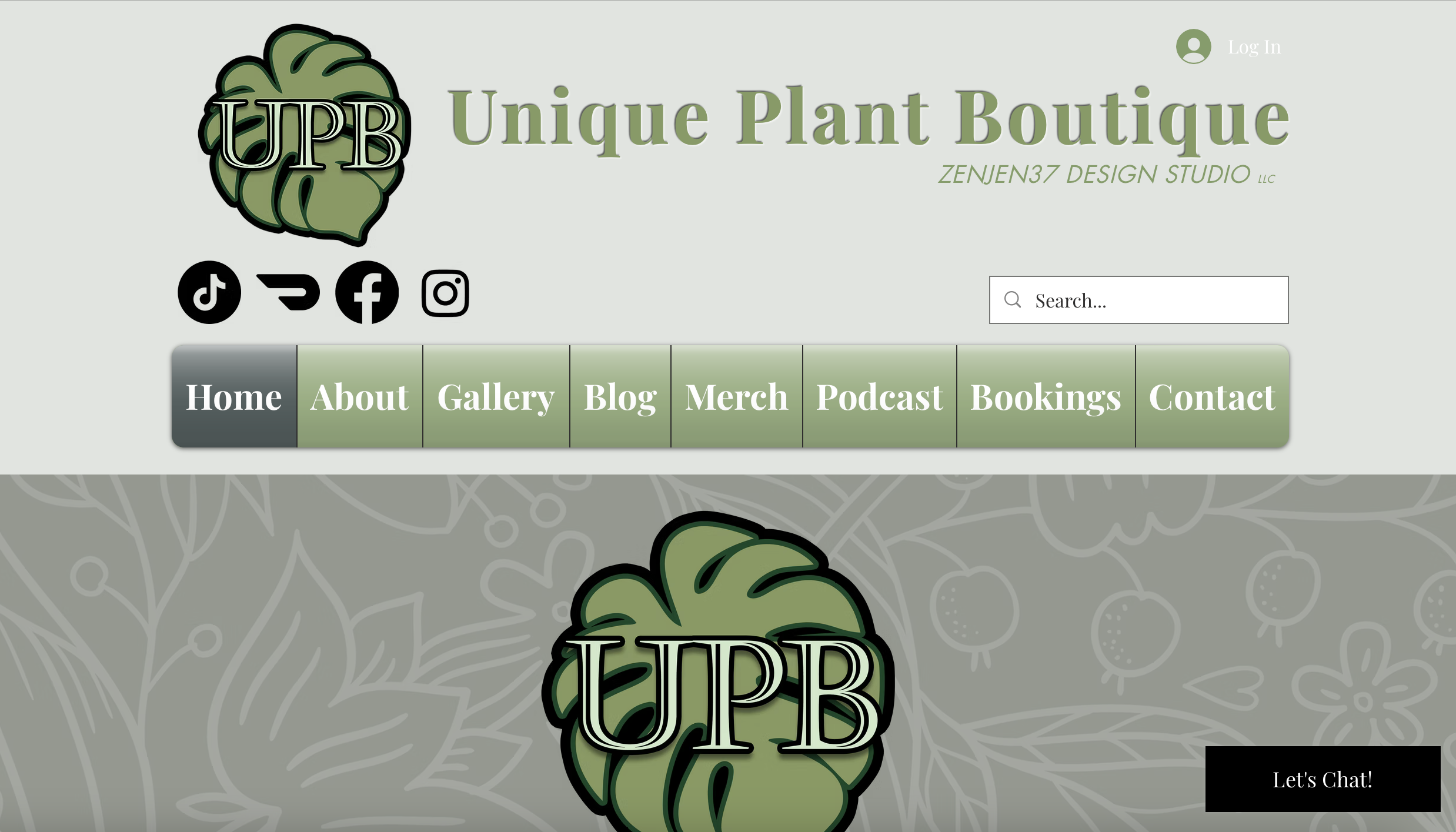
Current Logo
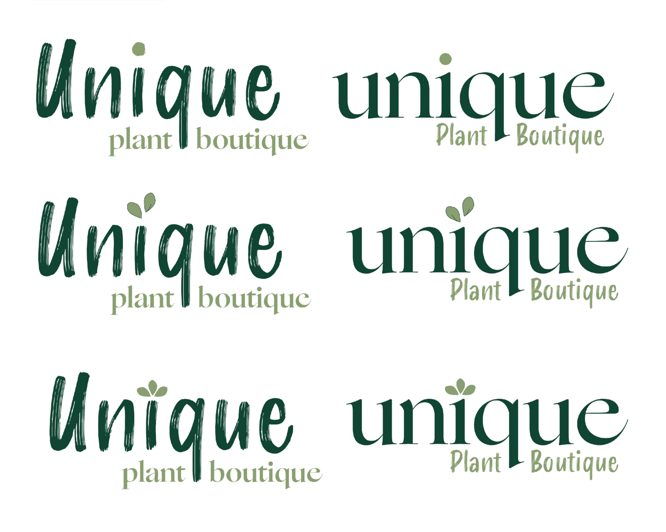
Logo Iterations
New Logo
Challenge & Direction
The challenge becomes how can I bring the brand together to feel stronger, more modern, and less overwhelming, while staying true to its welcoming voice.
Knowing that Unique Plant Boutique utilizes community, digital content, and sustainability, they need to emphasize these elements throughout their branding. They have many attributes that make them competitive and successful, but these are not currently being represented clearly.
Color Palette
FOREST GREEN
#114431
LUSH GREEN
#889E70
DIRT BROWN
#88725B
Vision